
Fri, 18 Jul 2025 16:12:05 +0000
A while back, our man Geoff Graham treated us to a refresher on the CSS initial-letter property, but how can you style drop and initial caps to reflect a brand’s visual identity and help to tell its stories?
Here’s how I do it in CSS by combining ::first-letter and initial-letter with other unexpected properties, including border-image, and clip-path.

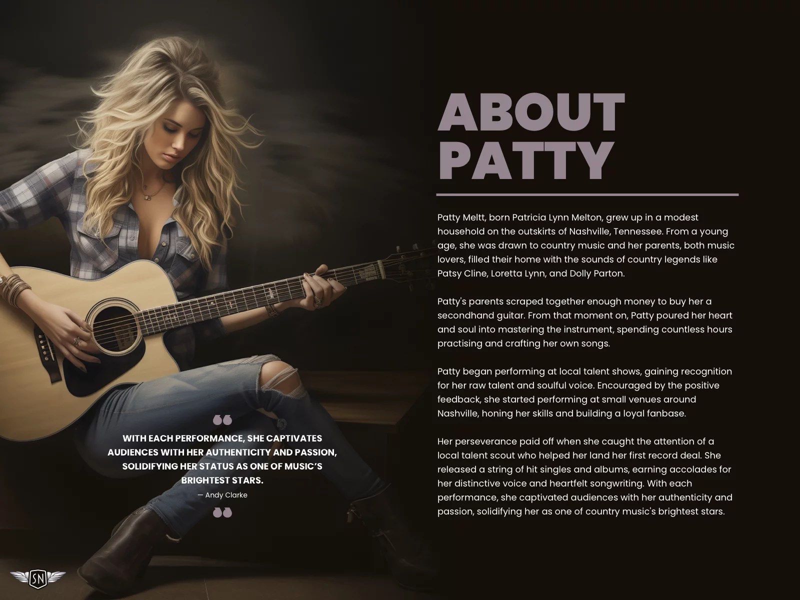
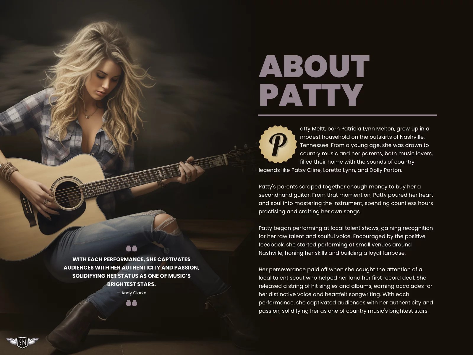
My brief: Patty Meltt is an up-and-coming country music sensation, and she needed a website to launch her new album. She wanted it to be distinctive-looking and memorable, so she called Stuff & Nonsense. Patty’s not real, but the challenges of designing and developing sites like hers are.
First, a drop cap recap. Chris Coyier wrote about drop caps several years ago. They are a decorative letter at the beginning of a paragraph, often spanning several lines of text. It’s a typographic flourish found in illuminated manuscripts and traditional book design, where it adds visual interest and helps guide a reader’s eye to where they should begin.
Study manuscripts from the Middle Ages onwards, and you’ll find hand-decorated illuminated capitals. The artists who made these initial letters were fabulously called “illuminators.” These medieval versals went beyond showing someone where to start reading; historiated letters also illustrated the stories, which was especially useful since most people in the Middle Ages couldn’t read.

On the web, drop caps can improve readability and reflect a brand’s visual identity.
A brief refresher on properties and values
In CSS, drop caps are created using the ::first-letter pseudo-element in combination with initial-letter. As you might expect, ::first-letter targets the very first letter of a block of text, enabling you to style it independently from the rest of a paragraph. The first number sets how many lines tall the letter appears, and the second controls its baseline alignment — that is, which line of text the bottom of the cap sits on.
p::first-letter {
  -webkit-initial-letter: 3 3;
  initial-letter: 3 3;
}
Because browser support still varies, it’s common to include both the unprefixed and -webkit- prefixed properties for maximum compatibility. And speaking of browser support, it’s also sensible to wrap the initial-letter property inside an @supports CSS at-rule so we can check for browser support and provide a fallback, if needed:
@supports (initial-letter:2) or (-webkit-initial-letter:2) {
  p::first-letter {
    -webkit-initial-letter: 3 3;
    initial-letter: 3 3;
  }
}
The initial-letter property automatically calculates the font size to match the number of lines a drop cap spans. On its own, this can make for quite a first impression. However, drop caps really start to come to life when you combine initial-letter with other CSS properties.
Tip: Interactive examples from this article are available in my lab.
Shadows
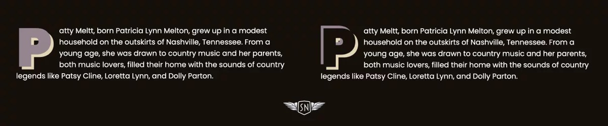
When I want to lift a drop cap off the page, I can add a single text-shadow. Shadows can be colourful and don’t have to be black. I created a full live demo you can check out.
p::first-letter {
  /* ... *//
  text-shadow: 6px 6px 0 #e6d5b3;
}
But why use just one shadow when two hard-edged shadows will turn a cap into a classic graphic typographic element?
p::first-letter {
  /* ... */
  text-shadow:
    -6px -6px 0 #7d6975,
    6px 6px 0 #e6d5b3;
}
Strokes

The text-stroke property — shorthand for text-stroke-width and text-stroke-color — adds an outline to the centre of the text shape. It’s a Baseline feature and is now widely available. I can make the cap text transparent or colour it to match the page background.
p::first-letter {
  /* ... */
  text-stroke: 5px #e6d5b3;
}
Backgrounds

Adding a background is a simple way to start making a cap more decorative. I could start by adding a solid background-color.
p::first-letter {
  /* ... */
  background-color: #97838f;
}
To add a lighting effect, I could apply a conical, linear, or radial gradient background image (here’s a demo):
p::first-letter {
  /* ... */
  background-color: #e6d5b3;
  background-image: linear-gradient(135deg,#c8b9c2 0%, #7d6975 50%);
}
And even an image URL to use a bitmap or vector image as a background (and here’s that demo):
p::first-letter {
  /* ... */
  background-color: #e6d5b3;
  background-image: url(...);
  background-size: cover;
}
Things become even more interesting by clipping a bitmap, gradient, or vector background image to the text while setting its colour to transparent. Now, the image will only appear inside the text space (demo).
p::first-letter {
  /* ... */
  background-clip: text;
  color: transparent;
}
Borders
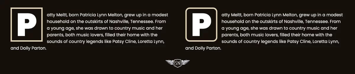
You might think borders are boring, but there’s plenty you can do to make them look interesting. I could start by applying a solid border to surround the cap box (demo).
p::first-letter {
  /* ... */
  border: 5px solid #e6d5b3;
}
Then, I could apply border-radius to slightly round all its corners (demo).
p::first-letter {
  /* ... */
  border-radius: 1rem;
}
Or, I might round individual corners for a more interesting look (demo):
p::first-letter {
  /* ... */
  border-top-left-radius: 3rem;
  border-bottom-right-radius: 3rem;
}
And then there’s the border-image property, a powerful, yet often overlooked CSS tool. By slicing, repeating, and outsetting images, you can create intricate borders and decorative drop caps with minimal code.

You can insert a bitmap or vector format image, or drop a CSS gradient into the border space:
p::first-letter {
/* ... */
border-style: solid;
border-width: 10px;
border-image: conic-gradient(...) 1;
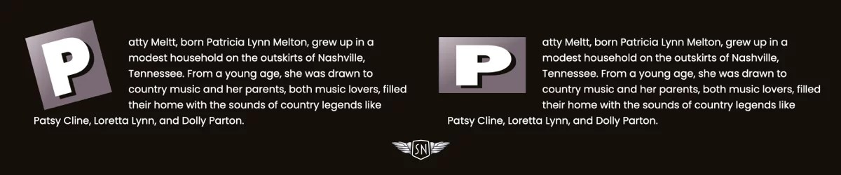
}Clipping

The clip-path property lets you define a custom shape that controls which parts of an element are visible and which are hidden. Instead of always showing a rectangular box, you can use clip-path to crop elements into circles, polygons, or even complex shapes defined with SVG paths. It’s an effective way to create visual effects like this right-facing arrow. Clipping the drop cap into an arrow shape isn’t just decorative — it reinforces direction and hierarchy, literally pointing readers to where the story begins. Here’s a demo of the following example.
p::first-letter {
  /* ... */
  padding-inline: 1rem 2rem;
  background-color: #e6d5b3;
  clip-path: polygon(...);
}
Or a glossy sticker shape cap, made by combining clip-path with a gradient background image and a text shadow (demo).
Transforms
You can transform a drop cap independently from the rest of a paragraph by rotating, scaling, skewing, or translating it to make it feel more dynamic:
p::first-letter {
  /* ... */
  margin-inline-end: 2.5em;
  transform: skew(20deg, 0deg);
}
And with a little trial and error to arrive at the correct values, you could even flow the remaining paragraph text around the cap using the shape-outside property (demo):
p::first-letter {
  /* ... */
  display: block;
  float: left;
  shape-outside: polygon(0 0, 0 200px, 250px 600px);
  shape-margin: 50px;
  transform: skew(20deg, 0deg) translateX(-60px);
}
Drop caps don’t just help guide a reader’s eye to where they should begin; they also set the tone for what follows. A well-designed drop cap adds visual interest at the start of a block of text, drawing attention in a way that feels intentional and designed. Because it’s often the first element the reader sees, caps can carry a lot of visual weight, making them powerful tools for expressing a brand’s identity.
Designing for Patty Meltt
Patty Meltt wanted a website packed with design details. Every element added to a design is an opportunity to be expressive, and that includes her drop caps.
Her biography page is presentable, but we felt a focus on where someone should start reading was lacking.
From the selection of designs I showed her, she felt the sticker-style cap best suited her brand.
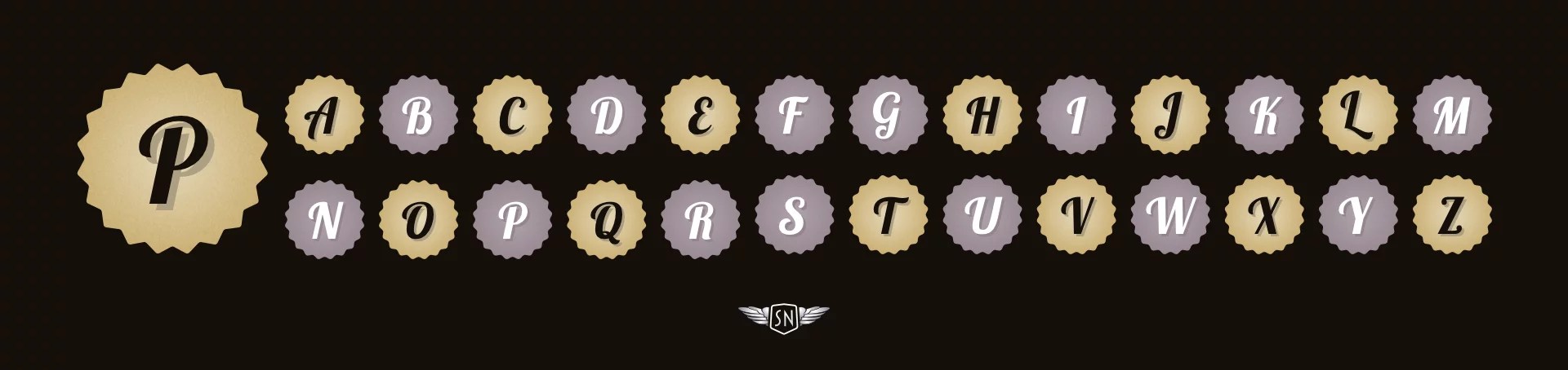
To implement it, first, I added a cursive typeface which matches her branding and contrasts with the rest of her typographic design:
p::first-letter {
  font-family: "Lobster Two", sans-serif;
  font-weight: 700;
}
I changed the cap colour to match the page background and added a semi-transparent text shadow:
p::first-letter {
  /* ... */
  color: #140F0A;
  text-shadow: 6px 6px 0 rgba(163,148, 117, .8);
}
Next, I clipped the cap box to a visible area shaped like a sticker:
p::first-letter {
  /* ... */
  clip-path: polygon(...);
}
…before applying two background images — a noise-filled SVG and a radial gradient — that I blended using a background-blend-mode:
p::first-letter {
  /* ... */
  background-image: url(img/cap-noise.svg),
  radial-gradient(circle, #e6d5b3 0%, #cdaa65 100%);
  background-blend-mode: soft-light, normal;
}
The result is a drop cap that’s as stylish as cut-off jeans and a pair of gator-skinned boots.
Conclusion
Styling drop caps isn’t just about decoration — it’s about setting a tone, drawing readers in, and using every detail to express a brand’s voice. CSS has the tools to go beyond the default: gradients, textures, borders, and even complex shapes all help transform first letters into statements. So don’t waste the opportunities that drop caps give you. Make ’em sing.
Getting Creative With Versal Letters originally published on CSS-Tricks, which is part of the DigitalOcean family. You should get the newsletter.
-
- 5 views
- 0 comments


